A bit of an update on our Icebergs charts concept. This idea was introduced almost 10 years ago, and a few extra elements have been added since version 3.
The Icebergs algo is not the fastest, so it’s not meant for daytrading, but it offers a unique way to see the overall market condition in a visual “landscape” type format that our brain can absorb much better than a bunch of abstract indicator lines.
To make this post more useful I am just going to share the latest long term monthly and weekly Icebergs charts for several major markets, and then illustrate the new elements in that context. So here goes:
Monthly SPX
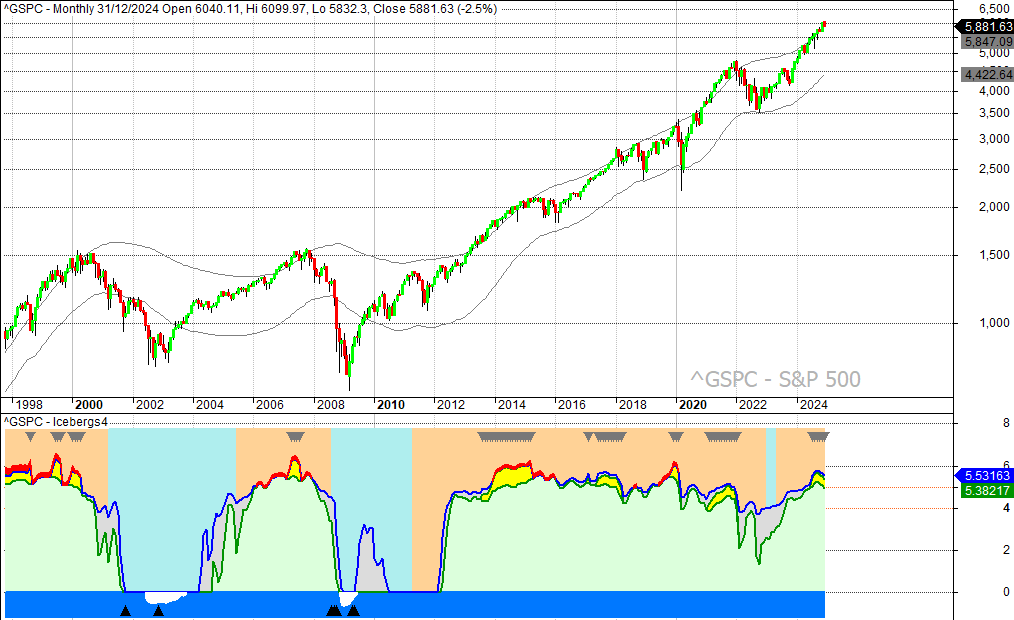
New element #1 is the sky, which is shown by the background color behind the mountains. It can be light blue or pale orange. When it is light blue the market is “cold” and acting more bearish, and if the sky is pale orange it tells us the market is more “hot” and bullish. This works as a kind of confirmation (or lack off) on what the rest of the chart shows. E.g. a healthy “green mountain” above 4 is normally accompanied by pale orange sky. If it isn’t then there is reason to doubt the move. Major long term buying opportunities tend to happen against a cold blue sky, but you still want to wait for other elements like “sea ice” and “fish” (triangles) in the water, to pick up the best moments. The years 2002 and 2009 give some very good examples of this.
New element #2 is the “vultures” (downward grey triangles) in the sky. They typically appear above mountain peaks, and usually coincide with “gold on the mountain” (yellow). Those vultures are the logical counterpart of the bottom fishing triangles that appear in the water. So, vultures are indications of a possible peak and fish tend to appear near important bottoms. Just like real vultures are very patient and can circle around for a long time before they get to eat, this is an indication that can appear for many bars in a row. So, it’s a waiting game when you see vultures, just be alert. As you can see in the chart, not every case of vultures foretells a major bear market, but almost every major bear market starts after a period of vultures ends. That’s what we need to remember about it.
OK. So what we see in that chart for SPX as 2024 ends is that we have green mountain well above 4, gold on the mountain, and pale orange sky. So, very clearly the conditions are bullish, as they have been for some time. No big secrets there. But the vultures have appeared around the summer of 2024, so more caution is warranted now, especially with the gold (yellow) on a downward slope. As you can see this downward sloping “gold” was also seen in 1999 and 2000, in late 2017, and in late 2021. On each of those occasion some serious downside price action followed.
Icebergs charts need to be studied visually, so to give you more practice material here is the monthly SPX Icebergs for 1970-2000:
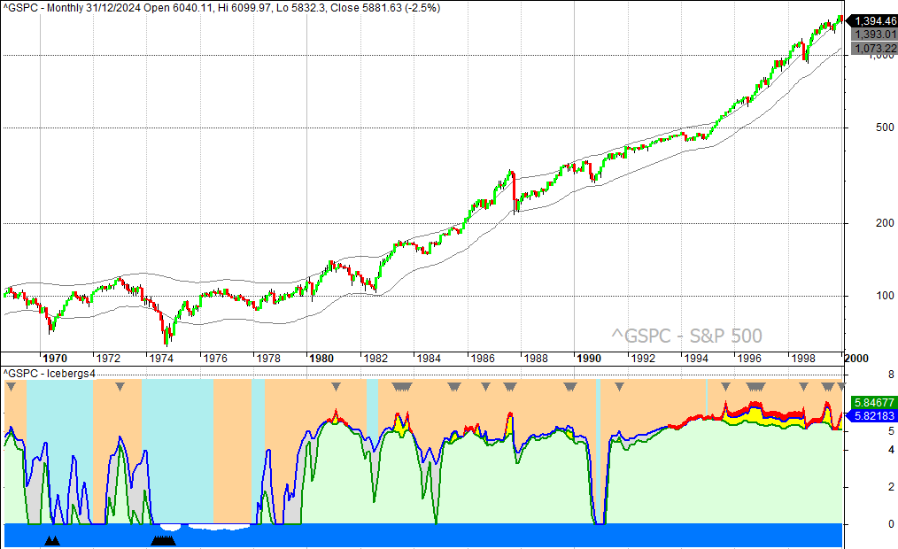
Note the weak or absent mountains and cold blue sky for most of the 70s. Also study the 90s. In exceptionally long bull markets you can have gold and lava, with or without vultures, for extended periods. That’s why seeing them is not a reason for instant panic, it’s just a reason to be aware that the given market is not that cheap anymore. But you don’t know when that move will end. Moving your stops a bit closer to the market is one of the ways to handle it. Remember that the monthly picture is just for the longer term orientation. Entries and exits are better done on the basis of weekly and/or daily charts. A few weekly charts will be given at the end of this post.
Monthly EURUSD
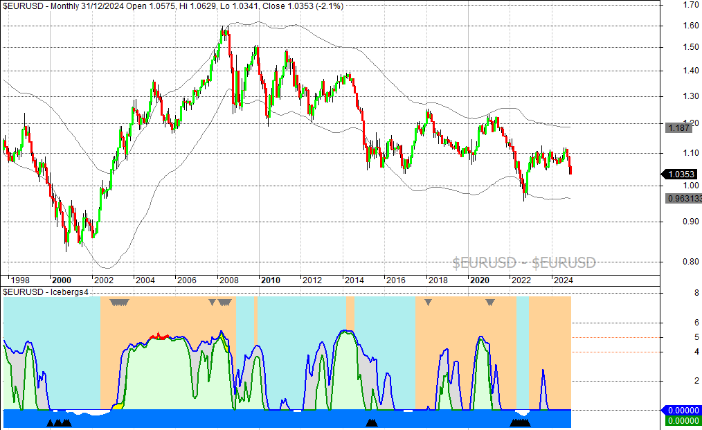
Clearly a much more bearish picture here. Note you would have done pretty well if you bought those bottom fishing chances and sold when vultures appeared in the sky. No method is prefect, but if you are a really patient investor you can do very well by waiting for the rare bottom fishing chances on a monthly chart and then hold for as long as things look good enough to hold.
Monthly Gold
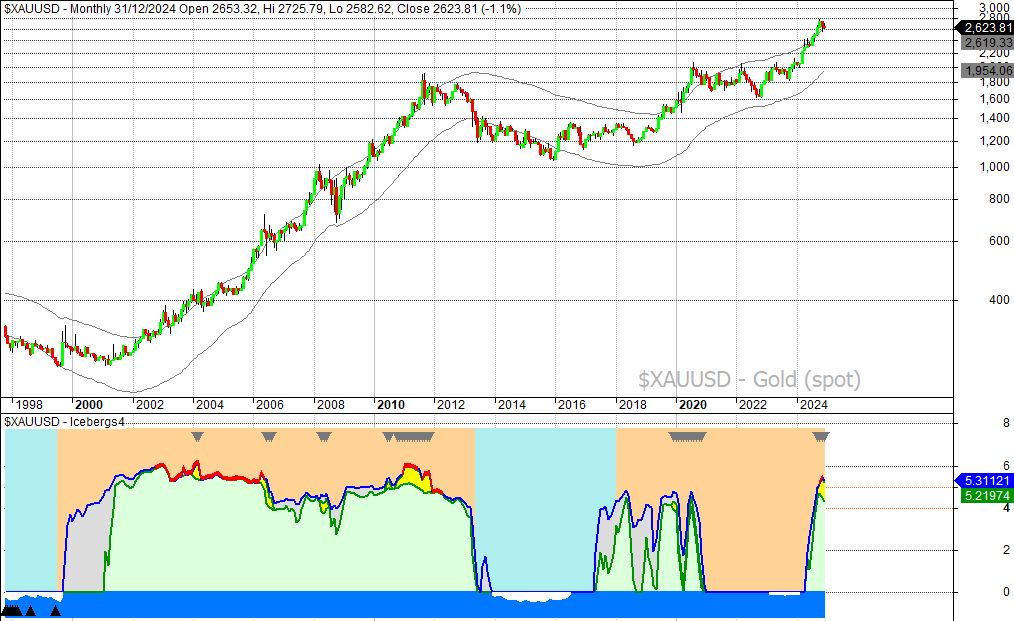
One of the more intriguing long term charts right now. The mountain has not been this high since the 2000-2012 bull market, and there is also lava. That means there is elevated risk for a correction or pause as we enter 2025, but note that the same situation happened in early 2004. That gave mostly sideways action for that year, and then the bull market continued. If the vultures go away, and the price of gold holds up, then a similar scenario can be in the making.
Weekly Bitcoin
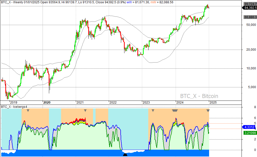
Weekly chart is the longest I can offer for Bitcoin (not enough data). Here we see the vultures have appeared in late 2024, and green mountain is falling away. Not a very good look. Nothing that can’t be fixed, but to do any new buying I prefer to wait for bottom fishing chances, which was last seen in mid 2022, when Bitcoin traded below $20,000. And yes, some traders like to talk about “bitcoin winter”. It is blue sky background with ice in the water that shows such winters in the Icebergs charts. If you can wait to buy in winters and do your selling on some warm days in summer when the mountains are green and high, then you will do better than most traders. If you missed the Bitcoin winter in 2022, then you can only wait for the next one. Of course, it looks easy when we study a chart with the benefit of hindsight. In real time it’s harder. Investing and trading will always come with a certain risk. You have to get in on very cold winter days if you want to buy near a long term bottom. But maybe even colder days are coming up. That’s the uncertainty.
Weekly Oil
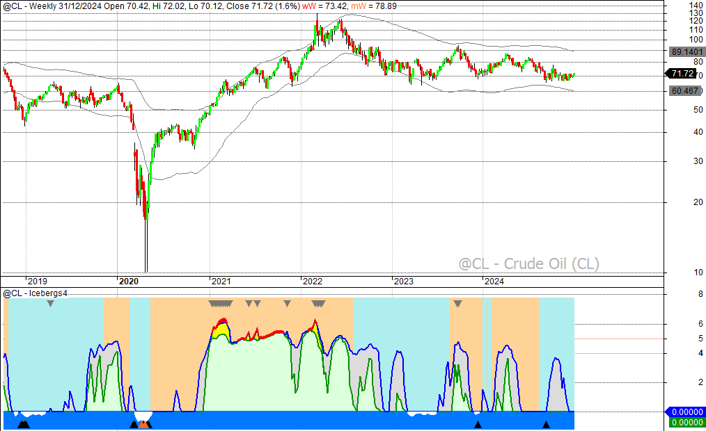
Weekly oil. A market that has gone very cold and almost dead (no significant price movements anymore). Green mountain above 4 has not been seen since 2022. That makes it one to watch. It could show a last capitulation move to the downside, or it could slowly improve and see green mountain come back. It has just painted a very large iceberg (grey), but nothing is happening (yet). Also take note of those pink bottom fishing chances (salmon) at the crash bottom in 2020. Those are very rare to see on monthly or weekly charts.
That’s it for today. Just subscribe to this blog or to our Twitter/X if you want to receive more posts like this one. Have a happy 2025!

A belated Happy New Year to you, Dan.
Absolutely brilliant charts and commentary. I look forward to seeing more.
Thanks for all that you do.
Thanks David. I am looking for a way to share them more frequently.
Very cool stuff, Danny. Hope to see more of the iceberg charts.
Thanks Ken.
This is AWESOME!!!
Thank you for the detailed explanation. I never fully understood/appreciated these charts before. WOW!!!
Happy New Year!
Debbie C. in Texas
Glad you like it. Happy new year to you too.