Today I want to show a little trick that works with quarterly charts.
The shorter the timeframe, the more noisy the data. Daily news items, Fed decisions, earnings reports,… can cause sudden spikes on hourly and daily charts. Such whipsaw moves can throw off indicators. In monthly or quarterly charts those daily variations even out over time, and we get a much cleaner picture, free from day to day noise.
But we do not have many useful data series that are long enough for a good quarterly chart. In this article we will take a look at S&P 500, Gold and Dow Industrials. Let’s start with SPX ( you can click the images to open a bigger version):
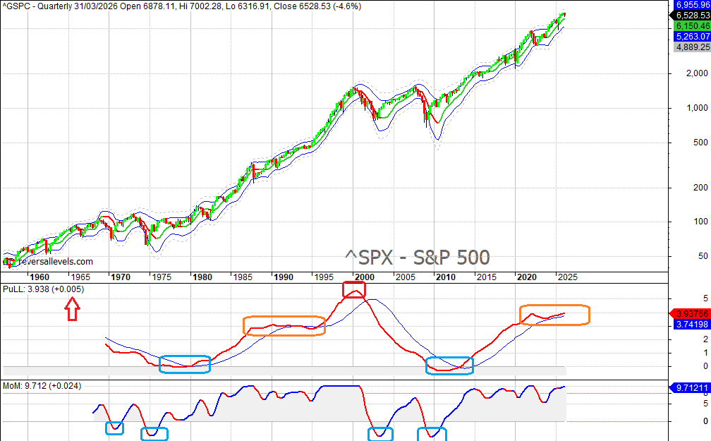
The MoM and PuLL indicators, which we also use on daily and weekly charts for the reversal levels service, are smooth indicators with low lag. The “BlueSnake”, generally contains price action most of the time (moves outside the Snake, dashed lines, are rare).
Let’s start with price action. The SPX just had a red quarterly candle, despite the index reaching new record highs during this quarter. Red quarterly candles are pretty rare, and usually followed by a green candle. But whenever you get back to back red quarterly candles after the market reached new record highs, it almost invariable leads in a bigger decline that sees prices fall to the bottom of the Snake (blue line or even dashed line). You can easily spot the historic examples of that in this chart. So if Q2 of 2026 is a red candle too, then it becomes the base scenario that the bottom of the Snake will get a visit. Currently that means around 5263 (blue line), or even 4889 (dashed line) if there is a panic move. So, that’s already something to keep an eye on in the coming months.
If we look at our smooth indicators, we can see the current situation in PuLL mimics 1987-1994, a sideways period with a weak upward bias that was followed by another surge higher in the late 1990s. That doesn’t mean we will get the same scenario, but it is a possibility. You can also see that generational opportunities to buy near major lows tend to come when MoM bottoms out below the zero line, and if possible near a PuLL bottom too. PuLL is more useful to identify long term tops.
Here we have the current quarterly gold chart, where we see the same concepts at work:
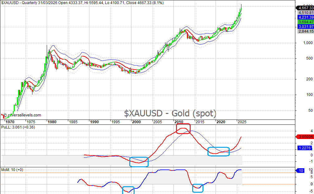
Try to do most of your long term buying near MoM lows below zero. That was 2002 and 2016. Keep an eye on PuLL for a possible long term top. That was 2012. It is clearly too early to consider a long term top right now, as PuLL is still climbing very fast and MoM is at +10.
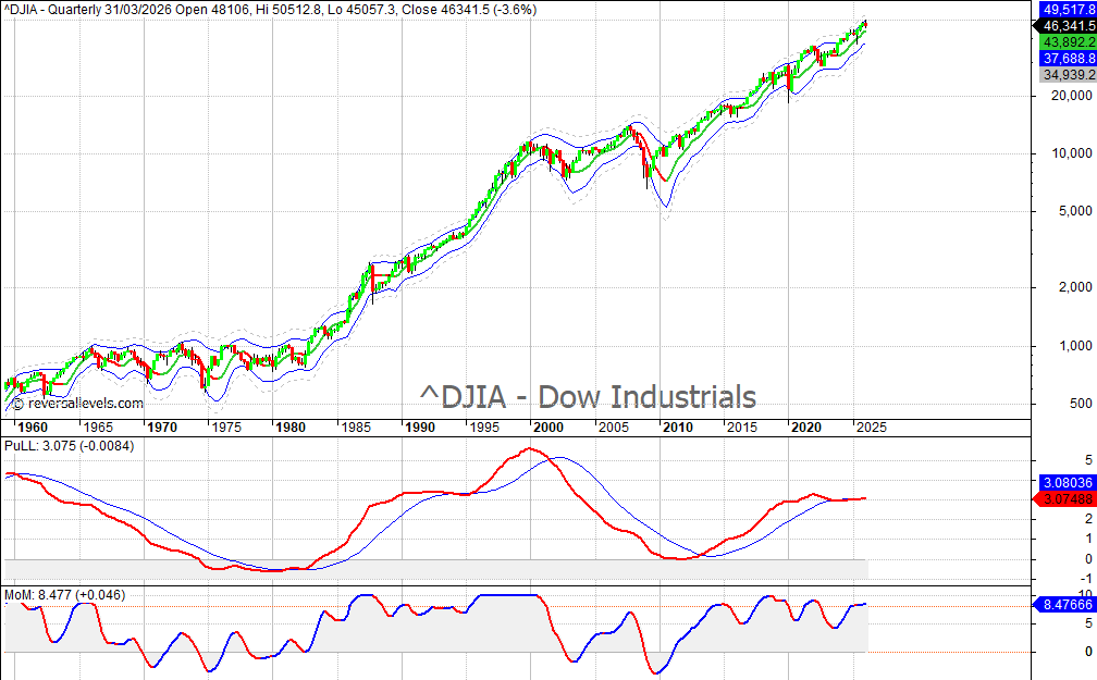
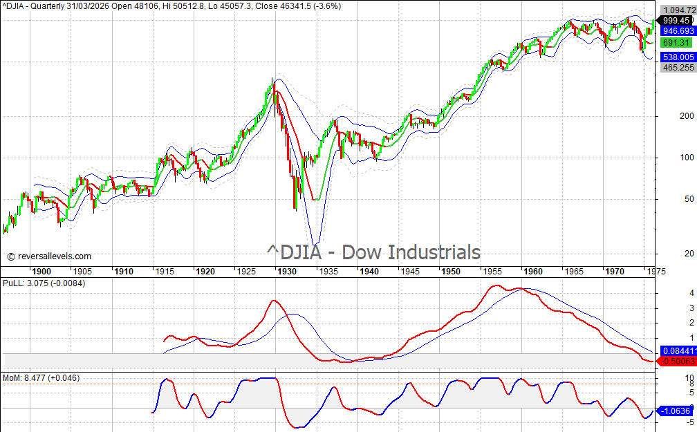
For the students of history, here are Dow Industrials charts since the early 1900s. History rhymes, as the saying goes. Study the past to understand the future.
Dow 1900 – 1970s.
Dow 1960 – present.